
Restaurant management software as a tool for higher profit and process control
Restaurant management software is a system that brings together accounting, marketing and analytics. It lets you see your real profit and control food cost.

Implementation and integrations
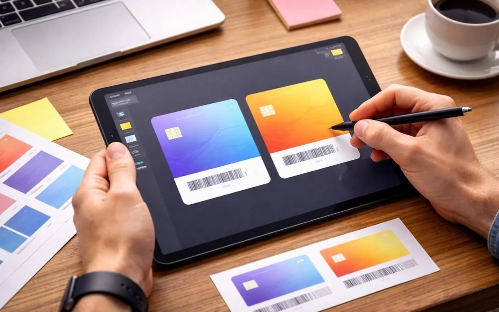
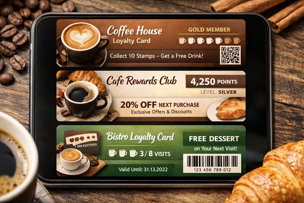
A Wallet loyalty card should be clear at first glance. The customer opens it while paying or before a visit and expects to see two things: the code to show and their benefit. If these are hidden, crowded or too complex, the card stops being a handy tool and turns into just a picture.
It's best to keep only the most important things on the first screen:
a code to scan at checkout (QR or barcode)
the main benefit: points or a discount
status or tier, if you use them
a short hint about the rules or a link to the rules
This is the minimum set that helps the customer quickly understand how to use the card. Everything else can go lower or into extra fields.
In the design, it's important to decide what matters most. If you have a points model, the points balance should come first. If you have a discount model, the size of the discount comes first.
Problems start when the card shows points, a discount, a deposit and several promotions all at once. The customer doesn't understand what exactly they get, and the cashier has to explain. So it's better to stick to one main model and make the design support it.
If you have tiers (for example, Basic, Silver, Gold), show the status next to the main benefit. But don't make the status the main element if it doesn't change how the customer behaves.
A good approach:
the status is visible but doesn't cover the points or discount
next to it, you can show what it takes to reach the next tier, if this motivates customers (for example, how much is left until the next status)
If you don't have tiers, it's better to remove the status completely so it doesn't take up space.
The code should be:
large and sharp
with strong contrast against the background
placed so no one has to look for it
Before launch, be sure to test scanning on your own equipment. Even a good design won't help if the scanner can't read the code the first time.
Simple backgrounds work best for a Wallet card: one color or a very light gradient. Complex images and detailed photos make the text and code harder to read, especially in bright light or on a dim screen.
If you want to use brand graphics, keep them low-key so they don't compete with the numbers and the code. It's better when the points, the discount and the offer hold attention, and the background simply supports the brand.
Customers often look for the card by its name in the list. So:
the card name should be short and clear
the logo should be easy to recognize even when it is small
If the brand has a complex logo, it's worth making a simpler version for the wallet, without small details, so it doesn't turn into a blur.
After the key elements, you can add extra details that help people use the program:
redemption rules (in short)
how long points or a coupon are valid
the current personalized offer
location addresses or a link to a map
support contact
a link to the customer account or website
An important rule: if the text doesn't fit into one or two short lines, it's better to give a link to a page with the rules than to try to fit everything on the card.
If you make personalized coupons, they should look like a specific offer:
what exactly the coupon gives
the last date it is valid
any limits, if there are some
Wording that is too general on the card lowers trust. The customer needs clarity: what they will get and on what terms.
A Wallet card gets updated: points, status and coupons change, and sometimes the design does too. It's important that the card stays easy to recognize. If you suddenly change the colors, the name and where things are placed, the customer may think it's a different card or that the old one is gone.
So it's better to decide these in advance and keep them:
a fixed place for the code
a fixed place for the main number
a fixed name and logo
one style for messages and offers
This way, the card will feel like a stable tool, not a short-term promotion.
Too much information on the first screen.
The customer sees a set of numbers and doesn't understand what matters.
Weak code contrast.
The code is hard to scan, or you have to look for the right angle.
Unclear benefit.
The card has words about loyalty, but no clear answer to what the customer gets.
Long rules in small print.
The customer won't read them anyway, and the text still takes up space on the card.
Do you need a bright design so people notice the card?
Brightness doesn't always help. What matters is that the card is easy to read and recognize. Usually, your brand color, your logo and a clean background are enough.
What matters more: design or how the card works?
How it works. If the code doesn't scan or the points don't update, a nice design won't bring results. Design should support ease of use.
Can the card show both points and a discount at once?
Yes, but only if the customer clearly understands what comes first and how it applies. In most cases, it's better to choose one main model and move the second one to the rules or offers.
How do you know the card is overloaded?
If the customer needs more than a couple of seconds to find the code and understand the benefit, the card should be made simpler.
What's better: separate coupons or one field with the current offer?
In most cases, one field with the current offer on the main card is easier. This way, the customer doesn't collect lots of cards in the wallet and doesn't get confused.
Restaurant management software is a system that brings together accounting, marketing and analytics. It lets you see your real profit and control food cost.

Restaurant management software for a chain lets you grow your business based on numbers, not guesses.
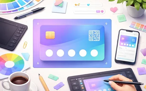
The banner and graphics on a Wallet card should look equally neat on iPhone and Android, load fast and not get in the way of reading the key fields.