
Restaurant and cafe management software for chains and multiple locations
Restaurant management software for a chain lets you grow your business based on numbers, not guesses.

Implementation and integrations
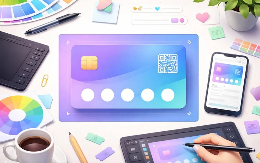
The banner and graphics on a Wallet card should look equally neat on iPhone and Android, load fast and not get in the way of reading the key fields. So choosing a banner format for a Wallet card is not about one file extension. It is about a set of requirements: quality, transparency, file size, color, a safe zone and testing on real devices. If you don't set these in advance, the card may look fine to the developer and worse to the customer at checkout.
Wallet cards most often use two options:
PNG
Good when you need a transparent background, sharp edges on a logo or icons, or simple graphics without artifacts. PNG files are usually heavier, so it's important to keep the file size under control.
JPG (JPEG)
Good for backgrounds and images without transparency, when a small file size matters. JPG handles thin lines and outlines on high-contrast edges worse, so it is used less often for logos.
If you're not sure, the rule is simple: logos and elements with transparency - PNG, background images without transparency - JPG.
Wallet apps show the card on screens with high pixel density. If the source image is small, it looks blurry. At the same time, very large files slow down loading and sometimes cause problems when adding the card.
A practical approach:
prepare images in good source quality, then reduce the file size
avoid scaling up from a small file
check sharpness at 100% zoom before export
It's also important to remember that some users make the system font size bigger. Because of this, the balance, status and terms on the card look different, and the background may start to get in the way of reading. So the background should be calm and not compete with the text.
Transparency is useful when:
the logo needs to sit on the card's brand background
you want to keep a flat background color and put a graphic element on top
clean shapes and neat edges matter
But transparency doesn't solve readability. If the background is very bright, it's better to add a separate backing panel under the text fields or choose a more neutral background. In practice, readability comes from contrast, not from effects.
Images that are too heavy can:
slow down the page where people add the card
make errors more likely when adding the card
make the experience worse on a mobile network
So it makes sense to set a technical file size limit for images and stick to it every time you publish. This keeps the team disciplined: the designer knows right away that they can't hand over an unprocessed file.
What usually helps reduce file size without losing quality:
a simpler background (fewer details)
careful JPG compression for backgrounds
removing extra transparency and invisible areas in PNG files
exporting for a specific element
A Wallet card is not a banner on a website. Customers open it to do something, not to look at it. So the background and the banner should support the interface, not pull attention away.
Working principles:
avoid fine patterns, extra textures and complex photos
don't put text inside the banner if it might get cut off or become hard to read
leave free space around the place where points, the discount and the code are shown
check the card in bright light and at minimum screen brightness
If you plan a dark background, make sure the text and the code still stand out. If the background is light, check that white elements don't get lost.
On different devices and wallet versions, the image may look a little different: in some places the corners are more rounded, in others the area is scaled differently. If a logo or a key element sits right at the edge, it looks distorted and like a mistake.
So it's useful to follow a rule: put important elements closer to the center and leave some space at the edges. This is especially important for banners with graphics that have meaningful details.
Testing should answer two questions: is the card easy to read, and does it look stable? A simple list of tests is enough for this, no need to overdo it.
The minimum set:
iPhone and Android (ideally two different Android devices, not one)
opening the link from a QR code and from a message (SMS or a messaging app)
viewing the card in the card list and on the card's own screen
checking that the code scans at your POS/scanner
checking data updates: you changed the discount/status - you see the update on the card
It's handy to keep a short internal checklist: who tested, on which devices, what was fixed. This way you repeat the same mistakes less often next time you publish.
Problem: the background makes the text hard to read.
Fix: make the background simpler, lower the contrast of details, add a flat backing panel under the text areas.
Problem: the logo looks blurry.
Fix: use a higher-quality source, export to PNG, check sharpness before you reduce the file size.
Problem: the banner looks different on iPhone and Android.
Fix: remove text from the banner, make the safe margins bigger, make the layout more neutral.
Problem: the card is slow to add.
Fix: reduce the image file size, remove extra details, check the file sizes.
Which Wallet card banner format should I choose if I need a transparent background?
Usually PNG, because it supports transparency and gives sharp edges for logos and graphics.
Can I use JPG for the banner?
Yes, if the banner is a background without transparency and you want a smaller file. JPG works worse for logos and thin outlines.
Should I write the promotion terms right on the banner?
Better not. Text in an image can get cut off or become unreadable on some devices. It's easier to show the terms in separate card fields.
Why does the same banner look different on different phones?
Because screens, pixel density, system zoom settings and the way each wallet shows cards are different. This is a good reason to test on several devices.
Which check is the most important before publishing?
That the key fields are easy to read and the code scans reliably at your checkout. If these two points are met, the card will be easy to use in real life
Restaurant management software for a chain lets you grow your business based on numbers, not guesses.
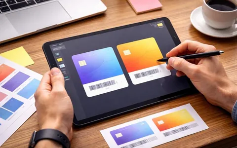
A Wallet loyalty card should be clear at first glance. The customer opens it while paying or before a visit and expects to see the code to show and their benefit
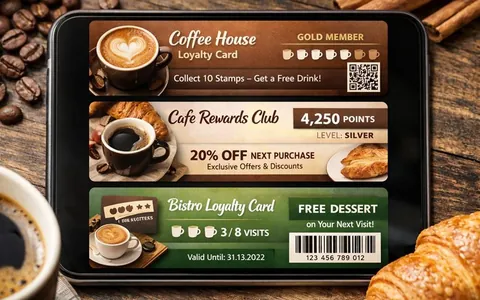
A Wallet card should help the customer quickly understand the benefit and easily use it at checkout or at the front desk.