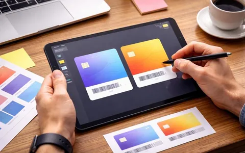
Wallet loyalty card design - card layout and the role of each part
A Wallet loyalty card should be clear at first glance. The customer opens it while paying or before a visit and expects to see the code to show and their benefit

Implementation and integrations
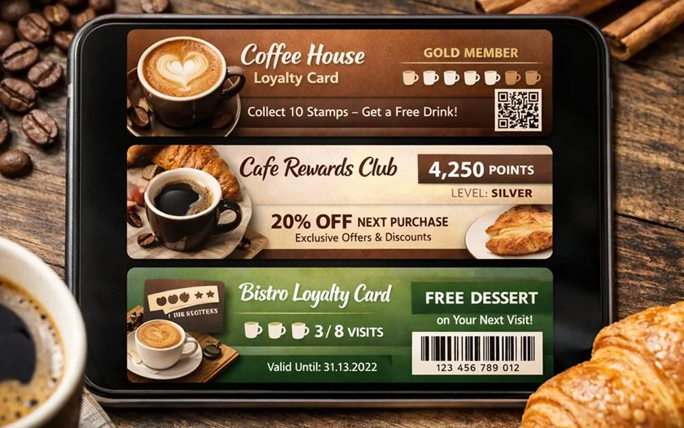
A Wallet card should help the customer quickly understand the benefit and easily use it at checkout or at the front desk. So it is better to build design ideas not around graphics, but around how people use the card: what they do, how often they come back and what value is clear to them. Below are Wallet card layouts for three common types of business: cafes and restaurants, beauty salons and retail stores. You can use all the ideas for both a points model and a discount model. Only the key number changes.
Whatever your business, the card should answer three questions:
who the customer is in the system (ID and code)
what they get now (points, a discount, an offer)
what they need to do to get more (if there are tiers or progress)
If the card tries to say several things, the customer starts asking staff. This slows down service and means the card gets used less.
Cafes and restaurants move fast: people come often, they decide quickly whether to come back, and there is no time to figure things out at checkout. So the design should be as short as possible.
Idea 1. Points balance + an active offer
On the first screen:
a code to scan
the points balance
an active offer, for example "Points can cover up to 20% of the check" or "A gift on your next visit before a set date"
Good when you want to bring the guest back for a repeat visit soon.
Idea 2. Tier discount + progress to the next tier
On the first screen:
the code
the current discount
the current tier
a short line: "N more purchases to the next tier" or "N rubles to go"
Good for chains and for formats where it is important to build the habit of coming back.
Idea 3. Stamps instead of a paper card
On the card:
the code
a progress counter: for example, "3 of 6"
the reward: "6th coffee free" and the end date, if there is one
Good for coffee shops and formats with repeat purchases.
Idea 4. Deposit and balance
If you use prepayment:
the code
the deposit balance
the rules for using it (very short)
Good for venues with regular guests and prepaid formats.
Salon visits are less frequent than cafe visits, but the average check is usually higher, and it matters more to keep the client for a course of treatments or regular care. The client needs to see their status and terms, but without too much information.
Idea 1. Points balance + a reminder of an available service
On the first screen:
the code
points or a discount
a short personalized offer, for example "A discount on care treatments until a set date"
Also, below:
the salon's contacts
a link to online booking
Good for bringing the client back within a set time.
Idea 2. Tiers by spend/visits + tier perks
On the first screen:
the code
the tier
the tier's benefit (for example, "7% discount" or "more points per purchase")
In extra fields:
a list of the tier's perks (short)
Good for a premium image and for salon chains.
Idea 3. Course progress
If you offer courses of treatments:
the code
the number of visits in the course or the sessions left
the end date or schedule
This makes things clearer and means fewer questions from the client.
In retail, a card is often used across different product categories. So it is important that the rules are clear and the offer does not confuse people.
Idea 1. Cashback in points + a limit on using them
On the first screen:
the code
the points balance
the rule for using points: for example, "points can cover up to 30% of the check"
In extra fields:
when the points expire
a link to the rules
Good when you want to manage purchase frequency and not slip into constant discounts.
Idea 2. Personalized offers by category
Instead of a general coupon, the card can show an offer based on the customer's interests: for example, for a category they buy more often. It is important to make the offer specific and give it an end date.
On the first screen:
the code
points or a discount
an active offer (just one)
Good when your CRM lets you segment your customer base and update offers.
Idea 3. A family card or a shared account
If you let several people use one card:
the code
the shared balance/discount
a short note that the card is a family card, if this matters for the rules
This option works well for everyday goods.
The choice depends on what you want to improve first:
a bigger customer base: make adding the card simple and give a clear reward for joining
repeat visits: show the benefit of the next visit and a time limit
a higher average check: use tiers or an offer for reaching a set amount
bringing back lapsed customers: a personalized coupon with a clear end date and terms
It is important that the card shows no more than one main offer at a time. If there are several offers, the customer does not understand which one applies.
do not put long rules in small print
do not show many numbers at once without saying which one matters most
do not suddenly change how the card looks unless you need to
do not make the code small or pale
do not give the customer many separate cards instead of one main card
These mistakes most often lead to a card that is added but not used.
What Wallet card layout works best for a cafe?
Usually, code + points/discount + one active offer for the next visit works best. It is fast and clear at the moment of payment.
What matters for a beauty salon?
It helps to add a booking link and show personalized offers with a time limit. If there are tiers or a course of treatments, show them neatly and briefly.
What is better for a store: a discount or points?
Points are chosen more often because they are easier to manage and you can limit how they are used. But the choice depends on your margin and the product category.
Can you make one Wallet card for different business formats?
Yes, if the layout is the same: code, main benefit, status, active offer. Only the field content and the rules change.
Should you add location addresses and contacts to the card?
Yes, this is handy, but it is better to put them in extra fields so the first screen is not overloaded.
A Wallet loyalty card should be clear at first glance. The customer opens it while paying or before a visit and expects to see the code to show and their benefit
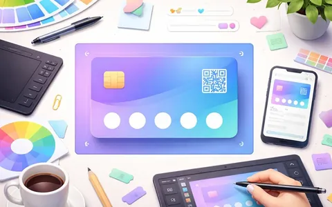
The banner and graphics on a Wallet card should look equally neat on iPhone and Android, load fast and not get in the way of reading the key fields.
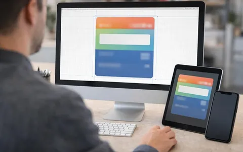
The banner and graphics on a Wallet card are not there just to look nice. They help people recognize and read the card. A customer opens the card at checkout in a hurry, sometimes in bright light, on different screens.