Wallet card banner format - which files to prepare and how to test
The banner and graphics on a Wallet card should look equally neat on iPhone and Android, load fast and not get in the way of reading the key fields.

Implementation and integrations
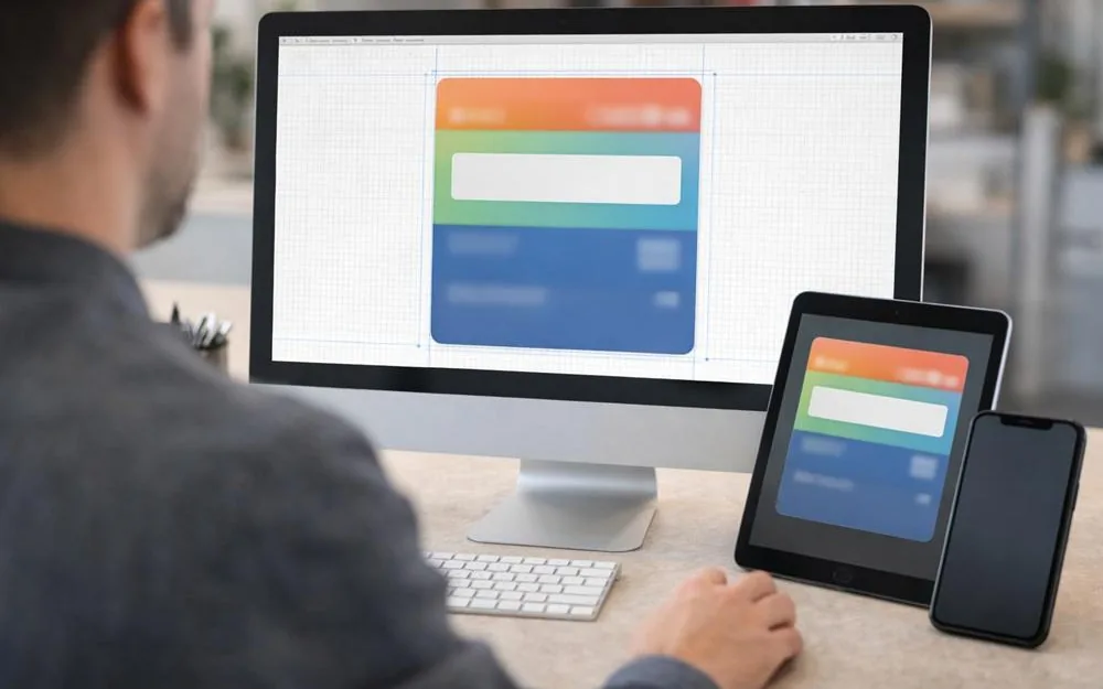
The banner and graphics on a Wallet card are not there just to look nice. They help people recognize and read the card. A customer opens the card at checkout in a hurry, sometimes in bright light, on different screens and with different text sizes. If the image is not prepared well, the card looks messy, and the main field with the benefit and the code gets lost. So it's better to look at banner size in Wallet cards more broadly: which images you really need, what wallet apps require from them, and how to test them so the card looks equally good on iPhone and Android.
Different Wallet cards can use different sets of graphics. Some use only a background and a logo, some add a top strip/banner, and some add small images for notifications. Below are practical tips and safe requirements that help you prepare images with no surprises on devices.
In most cases, a card uses 3-4 types of graphics:
1) Logo
A small brand image that helps people quickly find the card in the list. Requirements: simple, good contrast, no small details.
2) Card background or "cover"
A color or image that sets the look of the card. Most often it's a solid color or a soft gradient. Busy photos work worse because they make the text and code harder to read.
3) Banner or top graphic area
Sometimes it's a separate picture at the top, or an element that supports a promotion or the brand visually. Most questions about banner format and banner size are about this part.
4) Icon/thumbnail for notifications and the list
It is used in the wallet app and in push notifications. It should be as simple as possible and easy to read at a small size.
The exact pixel sizes depend on the template and on how your platform builds the card. So it's safer to rely on the "safe area" rule and on the quality of the original file:
use images with high enough resolution so they don't look blurry on Retina screens
avoid putting text inside the banner, because it often becomes unreadable when the image is scaled or cropped
keep key elements (logo, important details) in the center, with margins around the edges
A practical rule of thumb: make the banner/background in a "wide" format with extra space at the edges. Then you won't lose important elements when it adjusts to different screens and display options.
If your team needs a formal standard, you can set a rule: make all main images in high quality and in several widths, then pick the one that looks best in tests. This is faster and more reliable than trying to make one file fit "exactly".
Sharpness and contrast.
At checkout, the customer looks at the card quickly. If the background has too much detail, the text and code get lost. Solid backgrounds or soft textures with no "noise" work better.
File size limit.
Images that are too heavy slow down loading and sometimes cause display errors. When you give out cards on the web, it's better to keep files compressed, with no extra megabytes.
Color and text readability.
Don't make the background close in brightness to the text. Use either a dark background with light text, or a light background with dark text. The most common mistake is "looks nice, but you can't read it".
Text on the banner.
It's better not to add it. Text should go in the card fields, which the wallet shows in a predictable way. Keep only graphics and brand elements in the banner.
Checking "on one phone" is almost never enough. The minimum set of tests for the banner and graphics looks like this:
iPhone with normal and large text size
Android with Google Wallet on two different models (different screens and pixel density)
opening the card from an SMS and from a QR code (in different browsers)
how it looks in the card list and in the card itself
whether the code and main fields are easy to see over the image
how fast the "add card" page opens and the files load
The goal of the tests is simple: the card should be just as easy to recognize everywhere, and the key fields should be easy to read right away.
Mistake 1: too much detail in the background
Photos of the interior, people, or textures with small elements make the card harder to read. Fix: a solid background, a gradient, simple graphics.
Mistake 2: the logo is too small or "gets lost"
If the logo blends into the background, the card looks like it has no name. Fix: a contrasting background behind the logo or a simpler version of the logo for Wallet.
Mistake 3: text in the banner
Text often becomes unreadable because of cropping or scaling. Fix: text goes only in the card fields, and the banner holds only graphics.
Mistake 4: no safe area at the edges
The picture gets cropped on some devices, and an important element is lost. Fix: keep key details closer to the center and leave margins.
Mistake 5: the file is too big
It can slow down adding the card and make it less stable. Fix: compress the file to a reasonable size without losing quality.
So you don't have to come back to banner size with every launch, it helps to set a fixed process:
Make 2-3 versions of the background/banner: light, dark, neutral.
Remove text from the images and keep only graphics.
Check that the key fields are easy to read on a card mockup.
Test on devices and pick the best version.
Save the template to your library so you don't start from scratch.
This gives you a stable visual standard for different campaigns and formats.
Can you set the banner size in Wallet cards once and forget about it?
Usually you can't do it with "one number", because how the card looks depends on the template and the device. It's safer to keep safe margins, make the image with extra space, and test on iOS and Android.
Can the banner include promotion text?
We don't recommend it. Text in an image often gets cropped or becomes hard to read. It's better to show promotion text in a separate card field or as an offer you can update.
Which matters more: the banner or the background?
For recognition, the logo and the basic background usually matter more. A banner makes sense if you want to support a campaign visually, but it shouldn't get in the way of reading the text or scanning the code.
Why does the banner look fine on one phone but worse on another?
Different screen sizes, pixel density and system zoom settings change how it looks. That's why you need to test on at least a few devices.
How do you know the background is too "noisy"?
If at a quick glance the customer can't see the points/discount and can't spot the code right away, make the background simpler. Above all, the card must be easy to read.
The banner and graphics on a Wallet card should look equally neat on iPhone and Android, load fast and not get in the way of reading the key fields.
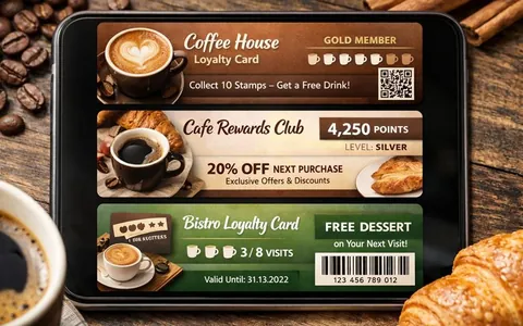
A Wallet card should help the customer quickly understand the benefit and easily use it at checkout or at the front desk.
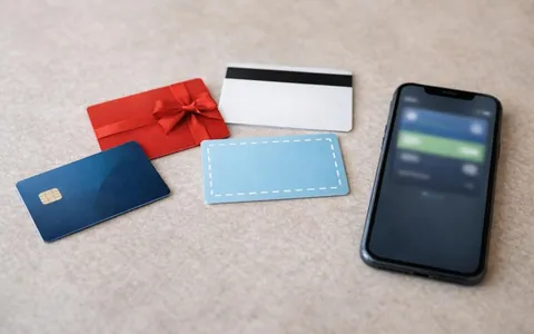
A points card in Wallet is a digital loyalty card. It is stored in Apple Wallet or Google Wallet and shown at checkout as a barcode or QR code.