
Restaurant guest retention programs based on CRM and automation
Guest retention programs work when you analyze and adjust them regularly. Restaurant management software gives the data, the CRM builds segments, and a CRM analyst checks the results.

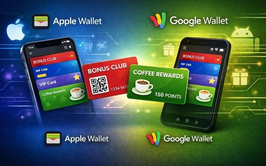
Digital cards for Apple Wallet and Google Wallet do the same job: give the customer a handy loyalty card on their phone. But in practice, these are two different platforms. They differ in how cards are shown, in design rules and in how they behave on devices. If you launch them without one standard, you get a mess: on iPhone the card looks neat, on Android it looks different, fields shift, offers don't match, and support has to deal with customer questions.
First, decide what exactly the card should show and how the customer will use it. For most loyalty programs, one main card is enough, where the customer always shows the same code.
The basic logic is the same for Apple Wallet and Google Wallet:
one customer ID and one code to scan
the main benefit: points or a discount
status or tier (if you have them)
one current offer or coupon (if you use personalization)
a link to the rules, contacts, the customer account or the website
Once the structure is set, design gets easier: you design the same elements and don't try to adjust the card to each platform every time.
To make digital cards for Apple Wallet and Google Wallet feel like one product, it helps to align three layers.
Visual layer
one set of brand colors
one logo style for small sizes
the same order: first the benefit, then the status, then the offer
Content layer
the same field names (for example, "Points", "Discount", "Status")
the same short wording of the rules
the same use cases: adding the card, showing it, updating it after a purchase
Behavior layer
the same logic for updating data
the same handling when the card is added again (no duplicates)
the same way of giving out cards: QR, a link after sign-up, a button on the website
If these three layers match, the customer doesn't notice the platform differences and uses the card the same way.
Even with the same design, cards may look a little different. The reasons are simple: screens, text size settings, the look of each wallet app. So it's important to:
not overload the first screen
keep field names and values short
keep key elements in fixed places
A practical rule: on the first screen of the card, keep only the code and 2-3 values. Everything else goes lower or behind a link. Then a change in text size won't make the card hard to read.
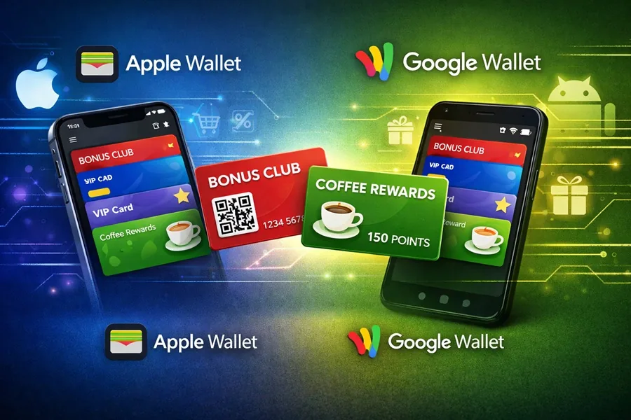
The customer doesn't care if it's Apple Wallet or Google Wallet. They care about what they need to do.
The best flow:
a QR code at checkout and at the counter
a link to add the card in a message after sign-up or a purchase
an "Add to wallet" button in the profile on the website
If the way of getting the card is different on each platform, mistakes start: the customer opens the "wrong" link, adds the wrong card, gets duplicates. So it's better to keep one way of giving out cards that decides by itself where to send the user: to Apple Wallet or to Google Wallet, with no extra choices.
A card is useful only if it shows current data. For loyalty, this usually means:
updating points after a purchase
changing the status when the customer moves up to a new tier
a current offer appearing or being replaced
correct behavior with returns and cancellations
It's important to describe in advance which events change the data and how fast the customer will see it. If updates don't happen right away, it's better to say so in the rules, short and clear. Otherwise, the customer sees a mismatch and stops opening the card.
If you use personalized offers, you need to decide how they will look on the card:
one current offer at a time
clear wording of the benefit
expiry date
a short condition for using it
For Apple Wallet and Google Wallet, it's better to keep the same text and the same structure. The design may differ, but the meaning should match. This means less work for support and simpler analytics: you know exactly what you showed the customer.
Before publishing, it helps to go through a short set of checks. It's not hard, but it covers most problems:
adding the card by QR and by link on iPhone and on Android
finding the card in the wallet by its name
scanning the code on your equipment
data updates after a test purchase
no duplicates when the card is added again
correct display with a larger text size on the phone
If all this passes, digital cards for Apple Wallet and Google Wallet will work as one product, not as two separate builds.
To avoid arguing about details at every update, it's handy to set a standard:
where the code is on the card
which field is the main one (points or discount)
what the card is called in the wallet
which fields are required and which are optional
what the current offer looks like
how links and contacts are shown
This makes launching new campaigns much faster and lowers the risk of mistakes when you make changes.
Can you make one design that looks the same in Apple Wallet and Google Wallet?
Not always exactly the same, but you can make one style and the same structure. If the first screen has few elements and a clear order, the differences will be very small.
What matters more for launching on both platforms: the design or the field structure?
The field structure and the update logic. Design without stable data brings no results. Once the structure is set, it's easier to make one style.
How do you avoid duplicate cards for one customer?
You need the rule "one customer, one card" and one ID. Then adding the card again leads to the same card instead of creating a new one.
Do you need separate links for iPhone and Android?
It's better to give one entry point (one link or QR) that detects the device and shows the right add button. This means fewer mistakes and fewer questions.
How do you know the card was launched correctly?
If the card can be added by QR and by link, the code scans at checkout, and points or status update after a purchase without manual fixes, you can call the launch stable.
Guest retention programs work when you analyze and adjust them regularly. Restaurant management software gives the data, the CRM builds segments, and a CRM analyst checks the results.

Today, restaurant management software is linked to marketing. If it only records sales and doesn't collect guest data, you lose the chance to manage visits.
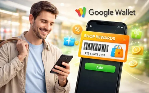
For a customer, Google Wallet is a handy place to keep cards and passes they need to show or use quickly.