
Guest acquisition and retention strategy for restaurants, built on management software
Today, restaurant management software is linked to marketing. If it only records sales and doesn't collect guest data, you lose the chance to manage visits.

For a customer, Google Wallet is a handy place to keep cards and passes they need to show or use quickly. For a business, it is a way to give out a digital loyalty card without a separate app and make it part of daily habits: open it, show the code, get the benefit. But for the card to work, you need to choose the right type and plan in advance what data to show.
Businesses most often use a few simple formats in Google Wallet. Basically, they differ in the job they do and the fields that must be on the first screen.
1) Loyalty card (points or club card)
The main format for most companies. This card holds the customer's ID, a code to scan at checkout and the key numbers: points, status, tier, and sometimes when the points expire or the rules for redeeming them.
When it fits: if you want retention, repeat visits, segments and analytics.
2) Discount card
It can look like a loyalty card, but the main number is the size of the discount. For the customer, it's simple: open the card, show the code, get the discount.
When it fits: if a discount is your main tool and you don't use points.
3) Coupon or offer
This is a card with a specific benefit and an end date. The offer must be stated clearly: what it gives, until what date, and what limits apply.
When it fits: to win back customers, for seasonal promotions and personalized campaigns.
4) Gift card
It holds the code, the value or the remaining balance, the end date and the rules of use. For a business, it is very important to update the balance correctly after the card is partly used.
When it fits: if gift cards are a product people buy often, and you want to solve the "lost the paper" or "can't find the code" problem.
5) Membership or subscription pass
A format for services with access for a set time or a set number of uses. The card shows the type of pass, the end date, whether it is active and, if needed, how many visits are left.
When it fits: fitness, entertainment, subscription services, packages of treatments.
6) Ticket or pass
Used for events and checking visits. It is needed less often for classic loyalty, but it fits where the business is built on entry, sign-ups and visits.
When it fits: events, clubs, places with passes.
Instead of choosing "what looks nicer", start from the program mechanics and how the customer behaves.
If the customer buys often (coffee shop, fast food, a corner store):
a loyalty card with a points balance or with progress toward a reward works best. The customer sees the benefit right away and uses the card often.
If purchases are less frequent but the check is higher (beauty salon, services, car repair):
tiers, personalized offers and short coupons with a clear end date often work better. On the card, it's important to show the status and one active offer.
If your product is a "gift card" or a "pass":
a separate card for the gift card or pass is usually easier, because the customer needs to find the right code quickly and see the balance or end date.
The main rule: in Google Wallet, it's better not to give a customer many different cards from one brand unless you need to. For loyalty, the best option is one main card, with offers as a field inside it or as rare separate coupons.
For the card to really work and not just exist, the first screen must have:
a code to scan (QR code or barcode)
the main benefit (points or discount)
status or tier (if you use them)
a short hint about the rules or a link to the rules
It also helps to add:
support contacts
a link to the customer account or website
the end date of the coupon or gift card, if there is one
If you show the rules, keep them short. A customer won't read a long text on a phone screen, especially at checkout.
Android has more kinds of devices and versions. So it's important to test:
adding the card by QR code and by link
adding it from a browser and from a messaging app
how the card looks in the list and when opened
scanning the code at your checkout
data updates after a purchase
Tests are not just a formality. They help you avoid common problems: some users don't see the add button, the code scans badly, or the card is hard to find in the list because of its name.
Mistake 1. Too much information on the first screen
The customer gets lost, doesn't see the main thing and doesn't understand the benefit.
Mistake 2. An unclear offer
There is a "promotion", but it's not clear what exactly the customer gets and until what date.
Mistake 3. A weak link with the POS system and CRM
If the purchase isn't recorded or the discount is applied by hand, you can't control the results the card brings.
Mistake 4. Not in line with Apple Wallet
On iPhone it works one way, on Android another. In the end, the support team has to explain two different flows.
Look not only at how many people added the card, but also at how they use it:
how many customers showed the card at checkout at least once
how many purchases were made with the card
how often people use coupons or redeem points
how repeat visits change for those who use the card
If people add the card but don't use it, the problem is almost always in the program mechanics, or the benefit on the card isn't easy to see.
What types of cards can a business add to Google Wallet without an app?
You can add a loyalty card, a discount card, a coupon, a gift card, a membership or a pass. You don't need an app if you give out cards by link or QR code.
Which is better - a separate coupon or an offer inside the main card?
An offer inside the main card is often easier: the customer doesn't collect many cards and finds what they need faster. Separate coupons make sense when they need to be kept apart, for example gift cards.
Can the card show points and a discount at the same time?
Yes, but choose which one is the main one. The first screen should have one main value, or the customer won't understand how to use the benefit.
Why does a card in Google Wallet sometimes look different than on iPhone?
The wallet looks different and works differently on different devices. If the card has a simple structure and short fields, the differences are small.
How do you get fewer support requests after launch?
Make the card's structure clear, make sure the code scans reliably, set up data updates after each purchase and test adding the card on several Android devices
Today, restaurant management software is linked to marketing. If it only records sales and doesn't collect guest data, you lose the chance to manage visits.
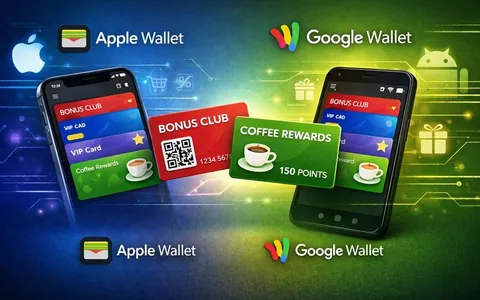
Digital cards for Apple Wallet and Google Wallet do the same job: give the customer a handy loyalty card on their phone

A targeted loyalty program is built on a simple idea: customers differ not only in how often they buy, but also in what they expect.